Its Logo May Have Been a First
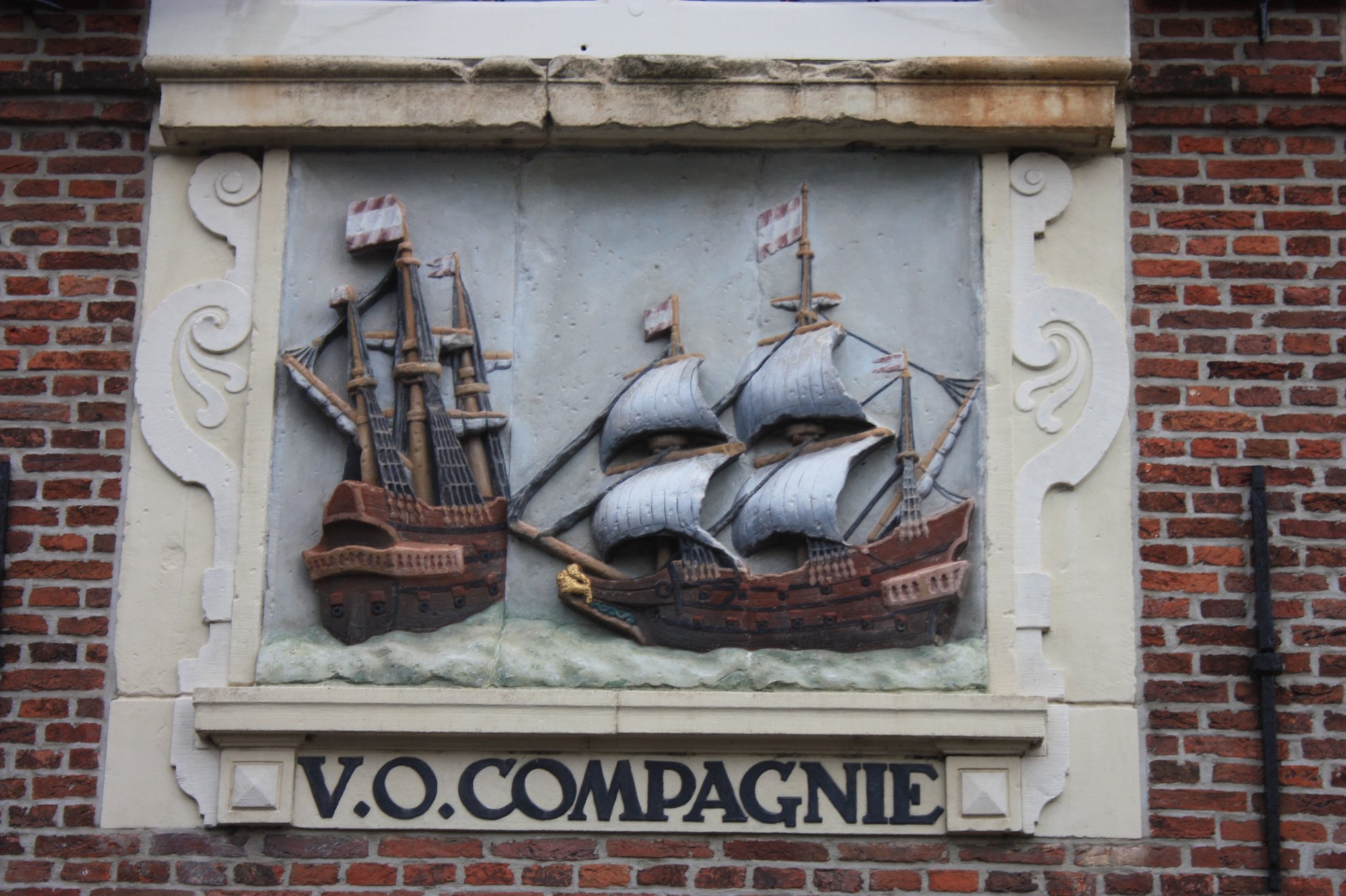
The Dutch East India Company, or VOC, used a monogram—a design made by combining letters—with a big V and an O and C woven into it. It may have been the first globally recognized corporate logo, appearing on flags, cannons, and coins across its trading empire.Dutch East India Company: The Logo That Circled the World
A Brand Before Branding
Its design was simple, clear, and flexible at a time when corporate identity was barely a concept. Even the hometown letter of the chamber running an operation could be added on top.Dutch East India Company: The Logo That Circled the World